User Experience Customization
The Experience tab allows you to customize the visual appearance, environment, and user interface elements of your shared AI agent.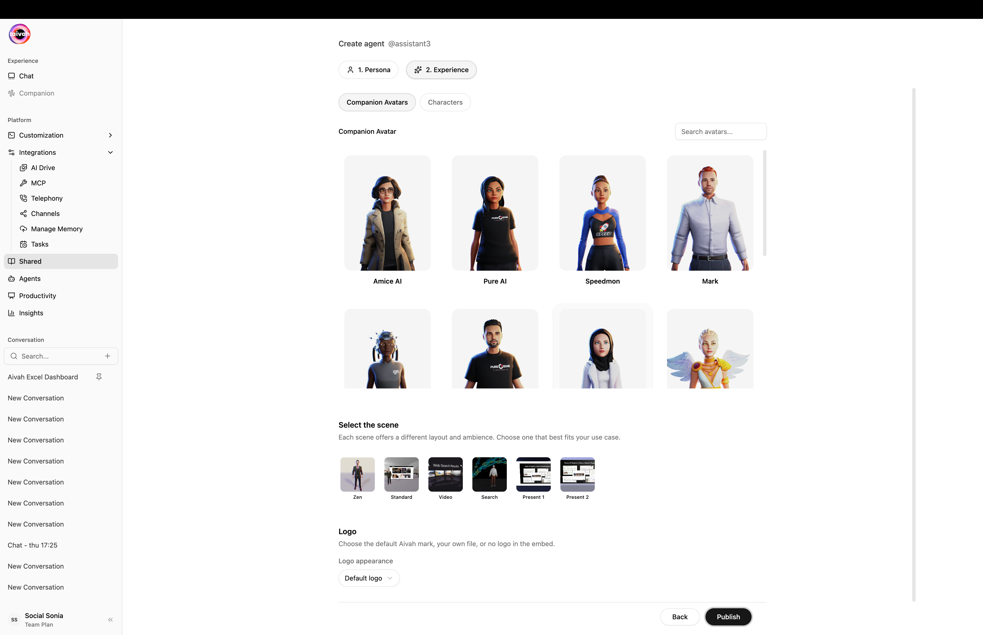
Experience step – Companion Avatars tab with searchable avatar grid and scene selector
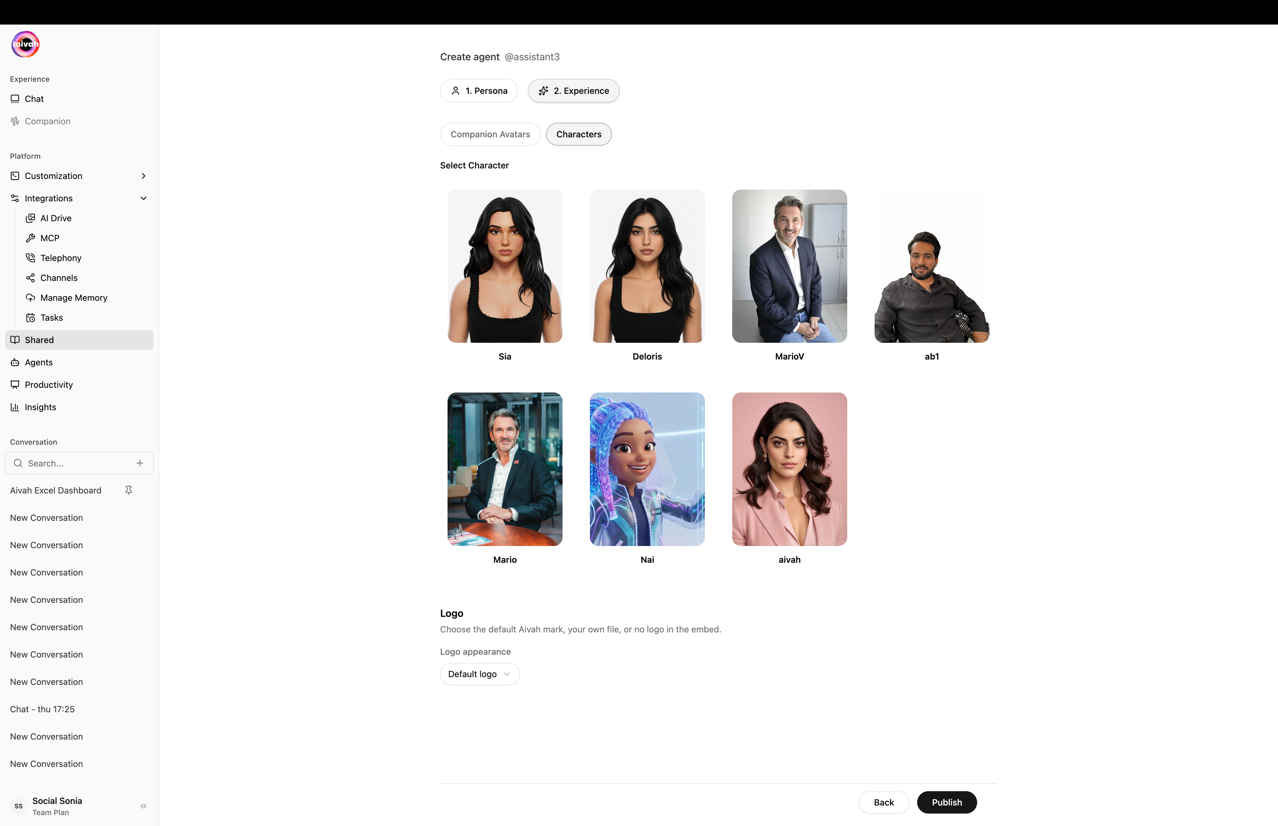
Experience step – Characters tab to pick a 2D character instead of a 3D avatar
Logo options
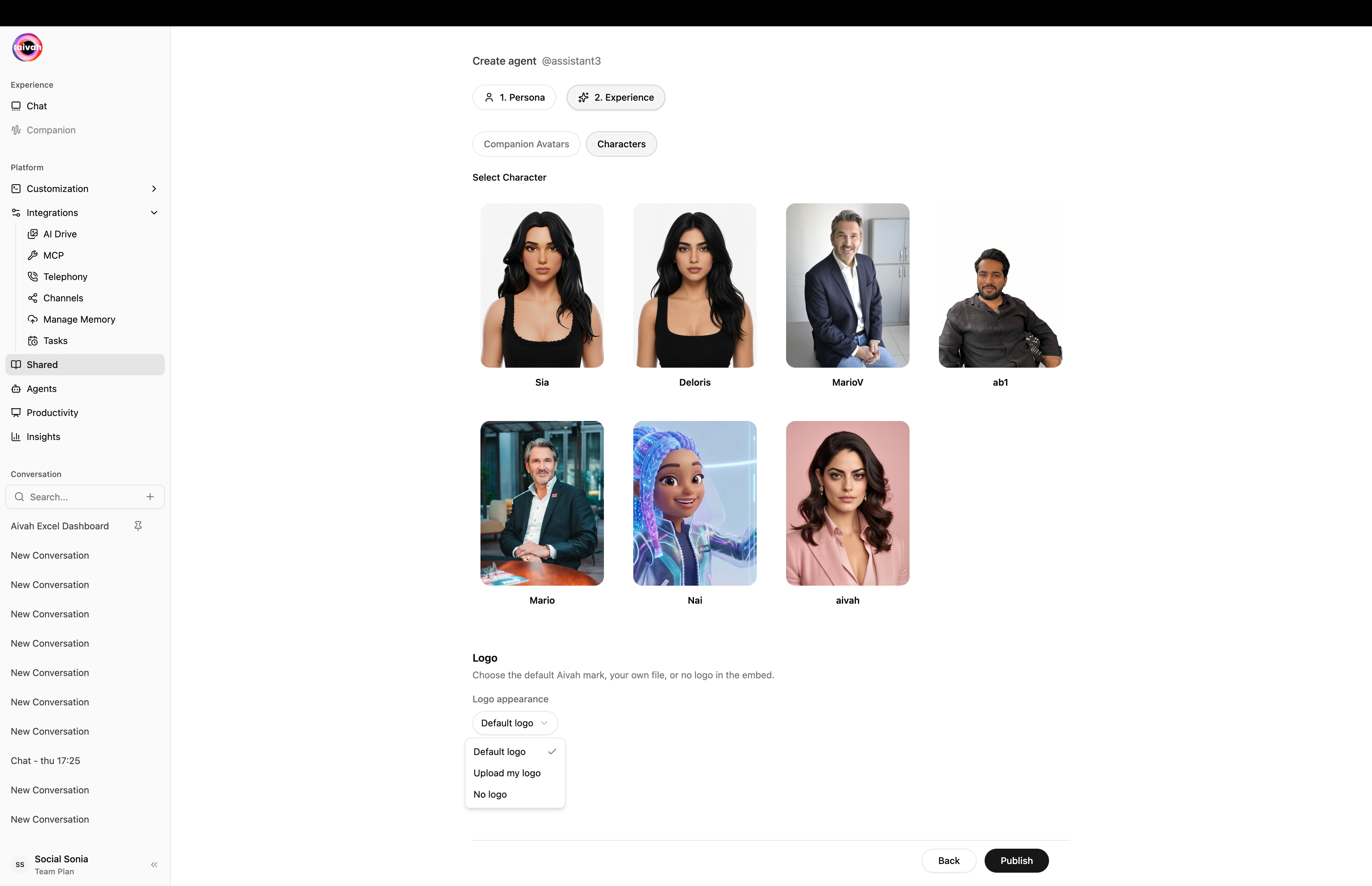
Logo dropdown – Default Aivah mark, Upload my logo, or No logo
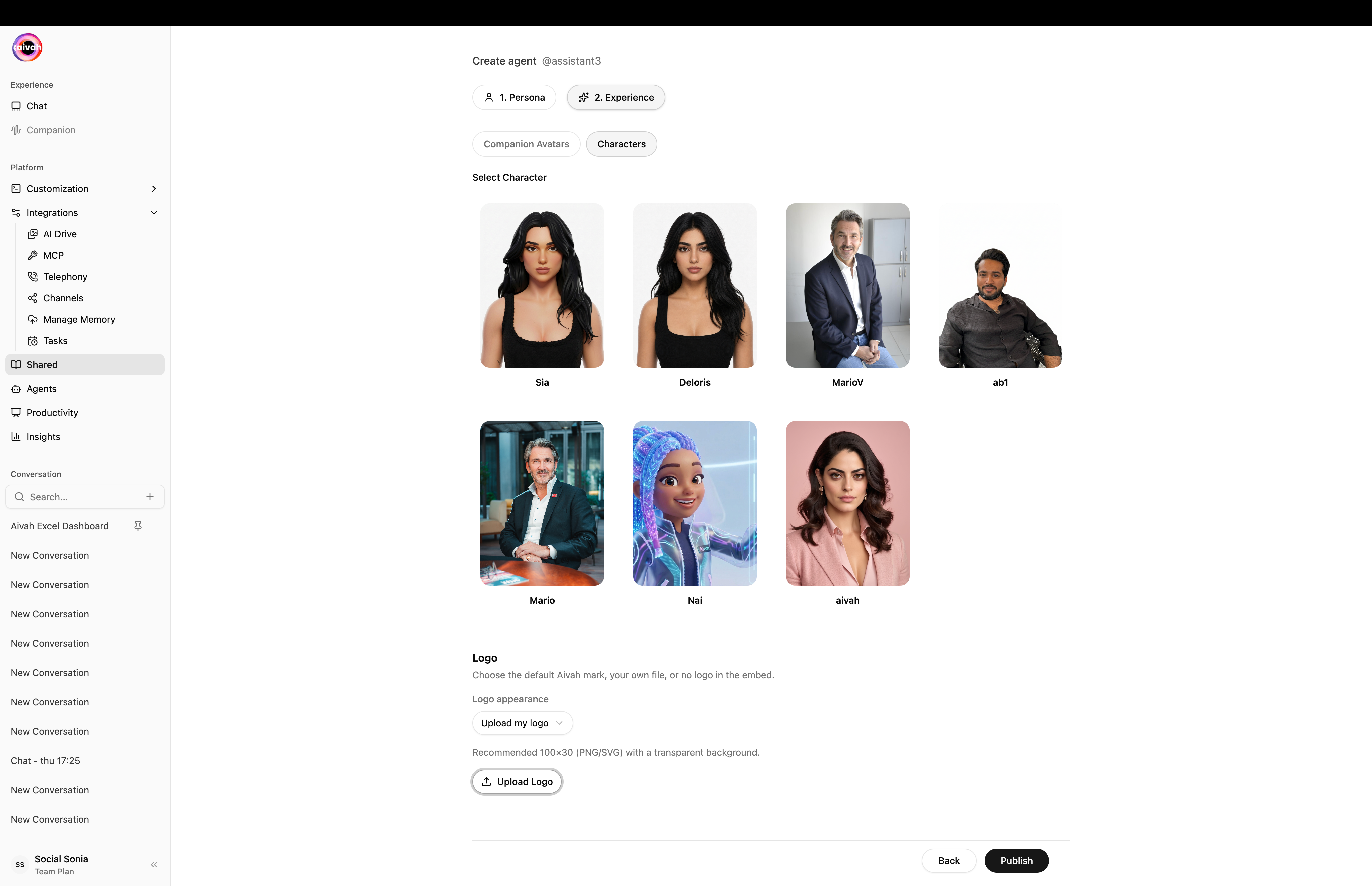
Upload my logo – recommended 100×30 PNG/SVG with a transparent background
Visual Environment
Background Selection
Choose from multiple background colors for your companion:- Color Palette: Select from predefined colors (blue, brown, yellow, green, cyan, purple, etc.)
- Custom Colors: Use hex codes for specific brand colors
- Background Themes: Match your brand or use case aesthetic
Scene Selection
Choose from various visual environments:- Office Settings: Professional workspace backgrounds
- Presentation Rooms: Formal meeting environments
- Casual Spaces: Relaxed, friendly atmospheres
- Tech Environments: Modern, digital-focused scenes
- Custom Scenes: Upload your own background environments
Avatar Customization
Avatar Options
- Pre-built Avatars: Choose from available character designs
- Professional Appearance: Business-appropriate avatars
- Diverse Representation: Multiple ethnicities and styles available
- Custom Upload: Upload your own avatar images (1600x30 pixels recommended)

Avatar Identity
- Avatar Name: Set the display name for your avatar
- Voice Selection: Choose matching voice characteristics
- Personality Alignment: Match visual appearance with behavioral traits
Interface Styling
Typography and Colors
- Font Family: Choose appropriate font styles
- Font Size: Customize text sizing (default: 14px)
- Color Scheme: Set colors for different interface elements:
- User font color (#FFFFFF)
- Prompts font color (#111)
- Aivah font color (#111)
- Input background color (#FFF)
- Scroll bar color (#637381)
Layout Options
- Face Focus vs Body Focus: Choose between close-up or full-body avatar views
- Interface Positioning: Adjust where elements appear on screen
- Responsive Design: Ensure compatibility across devices
User Interface Elements
Input Controls
- Input Placeholder Text: Customize the “Write message” prompt
- Message Styling: Configure how conversations appear
- Interactive Elements: Buttons, forms, and action controls
Data Collection Integration
- Form Styling: Match data collection forms to your visual theme
- Call-to-Action Design: Customize buttons and prompts
- Progress Indicators: Show form completion progress
Brand Consistency
Logo Integration
- Upload Logo: Add your company or product logo (1600x30 pixels)
- Logo Positioning: Choose where your logo appears
- Brand Colors: Ensure consistent color usage throughout
White-Label Options
- Remove Aivah Branding: Create fully branded experiences
- Custom Footer: Add your own attribution or links
- Domain Customization: Use your own domain for sharing links
Best Practices
- Brand Alignment: Match colors and styling to your existing brand
- User Testing: Test appearance across different devices and browsers
- Accessibility: Ensure sufficient color contrast and readable fonts
- Performance: Optimize images and assets for fast loading
- Consistency: Maintain visual consistency across all touchpoints